この節の作者: Jonathon Love
1. Basic UI Design
UIs for jamovi analyses are defined in the.u.yaml-file (a refresher on the files and the relationship between them is described here). This describes what sort of control each option is represented by (i.e. a dropdown list, or some radio buttons), and the order and the layout in which they will appear.
1.1. aggressive vs tame compiler mode
By default,
.u.yaml-files are inaggressivecompiler mode. This means when installing jamovi modules withjmvtools::install()the.u.yaml-files are regenerated and replaced each time. This is good early on in the development process, but as development progresses, getting a UI just right or adding custom behaviour requires hand editing of the.u.yaml-files. To prevent jmvtools from simply replacing all your changes, the.u.yaml-file can be placed intamemode. Intamemode the compiler respects your changes, and will not interfere with your adjustments. The trade-off is that the compiler often can’t insert new controls into the UI as optimally.To begin with we’d encourage you to leave your
.u.yaml-files inaggressivemode.
1.2. Controls
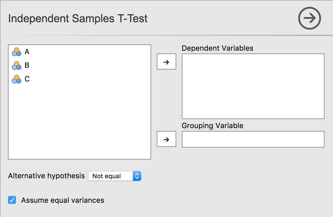
As we’ve seen earlier in this tutorial series with our t-test example, each option is represented by one or more controls. Our list option was represented by a list box, boolean options were represented by checkboxes, and Variable options were represented as a box that variables could be dragged to.
Let’s take a look at UI, and the
.u.yaml-file which is responsible for it:
title: Independent Samples T-Test
name: ttestIS
jus: '3.0'
stage: 0
compilerMode: aggressive

children:

- type: VariableSupplier
  persistentItems: false
  stretchFactor: 1
  children:

  - type: TargetLayoutBox
    label: Dependent Variables
    children:
    - type: VariablesListBox
      name: deps
      isTarget: true

  - type: TargetLayoutBox
    label: Grouping Variable
    children:
    - type: VariablesListBox
      name: group
      maxItemCount: 1
      isTarget: true

- type: LayoutBox
  margin: large
  children:
    - type: ComboBox
      name: alt

- type: LayoutBox
  margin: large
  children:
    - type: CheckBox
      name: varEq
As can be seen, controls are arranged in a hierarchy. At the very top is a control of type
VariableSupplier. It has two children:depsof typeVariablesListBoxandgroupof typeVariableListBox. Together, these three controls create the variables list, and the ‘Dependent Variables’ and ‘Grouping Variable’ drop targets.Next is a
LayoutBoxwhich contains the hypothesisComboBox, followed by anotherLayoutBoxcontaining the equality of variancesCheckBox. By default, items are laid out in a grid from top to bottom.TODO: how to layout controls in other configurations, group headings, etc.